
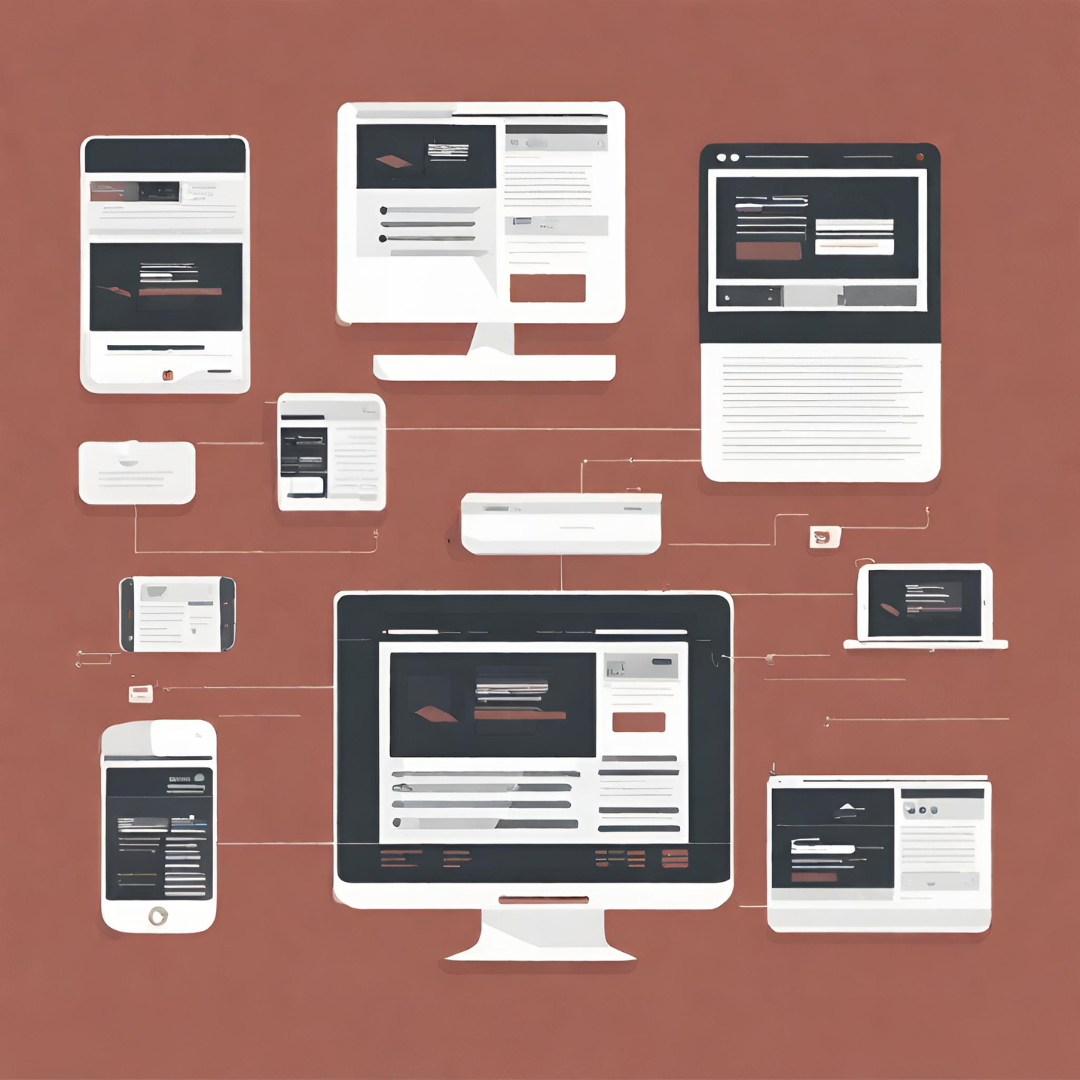
Responsive web design has become integral in catering to the diverse range of devices users utilize to access the web. BF DIGITAL delves into the significance of responsive design, focusing on fluid grids, flexible images, media queries, and the mobile-first approach for creating websites that adapt seamlessly.
Fluid Grids and Flexible Layouts
Implementing fluid grids and flexible layouts ensures that web content adapts dynamically to various screen sizes, maintaining consistency and usability.
Flexible Images and Media
Utilizing flexible images and media enables multimedia content to scale proportionally, enhancing the visual experience across different devices.
Media Queries for Device Adaptability
Applying media queries allows websites to respond to different device characteristics, adjusting styles and layouts accordingly for optimal viewing.
Mobile-First Approach for Accessibility
Embracing the mobile-first approach prioritizes mobile design, ensuring a smooth and intuitive experience for users on smaller screens.
BF DIGITAL: Crafting Responsive Experiences
At BF DIGITAL, we emphasize responsive design principles, creating websites that seamlessly adapt to various devices, delivering an exceptional user experience across the board.
Experience the power of responsive web design with **BF DIGITAL**. Contact us to discuss how our design expertise can elevate your web presence.


